


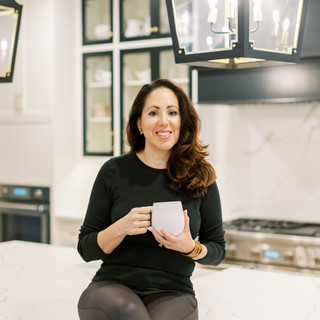
2025 Moody Home Trends:The New Color Palette That’s Anything but Boring
- Janet Campbell
- Jul 1, 2025
- 5 min read
Updated: Aug 6, 2025

2025 Moody Home Trends: The New Color Palette That’s Anything but Boring
HOW '70's-INSPIRED HUES ARE BRINGING SOUL AND SOPHISTICATION BACK INTO TODAY'S INTERIORS
If you’ve been following along lately, you may have noticed a quiet shift in the world of interior design—one that feels a little moodier, a little richer, and honestly, a whole lot cozier.
For a while, everything leaned light, bright, and neutral. And while there’s always a place for that clean aesthetic, lately I’ve been drawn to something a little deeper... more grounded… and dare I say, a little moodier.
Earthy tones and muted colors are making a big comeback, and I am here for it. As a designer, I’m always paying attention to how color can transform a room—not just visually, but emotionally. And I have to say: I’ve been loving this new wave of '70s-inspired moody home color trends of 2025 that are finding their way back into the spotlight… only now, they’re a bit more elevated and tailored.
These tones—think olive green, terracotta, soft clay, rich chocolate, and dusty plum—bring so much warmth and soul into a space without being overly bold or trendy. They’re timeless, layered, and full of personality. And best of all? They create the kind of home that just feels good to live in.
So, let’s take a look at why these tones are having a moment, how I’m using them in current projects, and why this palette might be the refresh your home didn’t know it needed.

Why Earthy & Muted Hues Are Having a Moment
One of the biggest requests I get from clients is that they want their homes to feel “inviting but elevated". They’re not necessarily after flashy colors or dramatic statements—they want spaces that feel cozy, rich in detail, and still totally livable. That’s exactly where this color palette shines.
There’s something comforting about colors that feel pulled from nature. They add depth, create warmth, and help a space feel more settled—like it’s always been there. And in a world that feels a little too fast and digital at times, it’s no surprise that we’re craving colors that ground us.
These shades also carry a beautiful nod to 1970s interiors—but without going full retro. Think less avocado appliances and more handcrafted clay tile, unlacquered brass, and layered textures in colors that tell a story.
It’s a color story that’s quietly elegant—never loud or trendy. Which, in my opinion, is the best kind of design.


My Go-To Earthy & Muted Tones Right Now
Let’s talk about the colors I’m personally reaching for lately—whether I’m working on a cozy bedroom retreat, a kitchen remodel, or a bold little powder room. These tones have been on repeat for a reason:
Terracotta & Burnt Sienna
I’ve always loved the warmth of terracotta—it reminds me of travel, hand-thrown pottery, and sun-soaked walls. It’s earthy, yes, but when paired with creamy neutrals or brushed brass, it suddenly feels incredibly chic. I love using it in tile work, accent walls, or even in textiles like drapes and bedding. It instantly brings warmth to a space and looks beautiful in natural light.
Olive, Moss & Sage Green
These muddy greens are so versatile. They’re soft enough to act as a neutral but add just the right amount of color. I’m using them on cabinetry, in wallpaper patterns, and even as statement paint colors for moody home offices or dining rooms.They feel especially beautiful when paired with wood tones or layered textures like linen and bouclé.
Ochre & Mustard
This one might surprise you, but ochre is becoming one of my favorite “pop” colors. It’s bold but not overpowering—like a well-worn leather saddle or a golden autumn leaf. I’ve been pairing it with ivory, warm walnut, and even soft pinks for a fresh take.
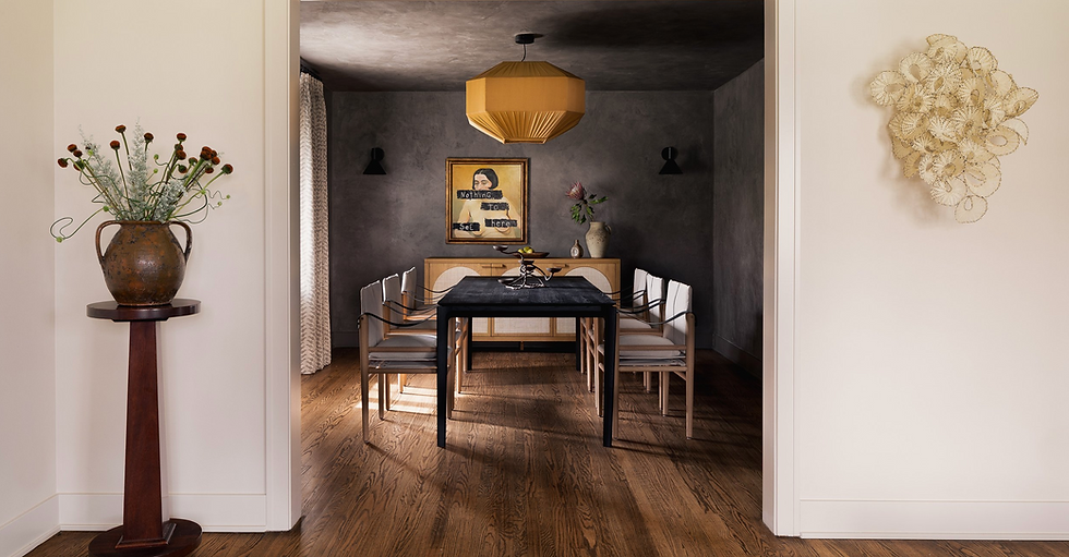
Chocolate Brown & Deep Taupe
Brown is definitely back—and in the best way. It’s luxurious, grounding, and honestly feels a bit like a hug in color form. I’ve used deep chocolate tones on bathroom cabinetry and even trim in more traditional spaces. For clients who want something timeless but a little unexpected, this has become a go-to. It’s also a great way to introduce depth without going to a full black or charcoal. And when it’s paired with creamy walls or soft, muted metals? The contrast is stunning in the most subtle way.
Dusty Plum & Muted Mauve
I know purple can feel intimidating, but hear me out—this isn’t the bright violet from a kid’s room. These toned-down plums and mauves have this romantic, slightly vintage quality that I absolutely love.I’ve used a dusty plum modern design wallpaper in my home office and it completely transformed the space—giving it warmth, texture, and a little bit of that ‘70s mid-century vibe.
Where These Tones Really Shine
You don’t have to repaint your whole home in burnt sienna to embrace this palette. (Though if you do, call me—I’d love to design that.) But seriously, these colors are incredibly flexible, and I find myself using them in all sorts of spaces:
Kitchens: Moody green or taupe cabinetry is a beautiful departure from standard white. Add aged brass and handmade tile, and you have a kitchen that feels warm, collected, and classic.
Powder Rooms: These are the perfect spots to be bold. I love going deep and moody in small spaces—it feels like a little jewel box moment.
Primary Bedrooms: Earthy tones are naturally calming. Think layers of warm neutrals, a soft olive accent wall, and plenty of texture through textiles and finishes.
Living Spaces: Add depth through upholstery, vintage rugs, and layered accessories. You’d be amazed how a chocolate velvet pillow or ochre accent chair can change the feel of a space.

It’s All About the Layers
If there’s one thing I emphasize to my clients when working with this palette, it’s layering. These colors come alive when combined with the right textures and materials.
"Think linen drapes against a moody painted wall. Bouclé or velvet paired with aged wood. Patinated brass next to a deep brown cabinet."

The magic isn’t just in the color—it’s in how the room feels when all these elements come together. That’s the part I love the most.
Why My Clients Are Loving This Shift
I work with homeowners who are investing in their homes for the long term—and who want a space that reflects their lifestyle and tastes, without having to make design decisions every two years. And what I’m hearing again and again is:“I want my home to feel cozy, layered, and put together.”
This palette answers that call. It feels considered. It feels personal. And because it draws inspiration from the past—without mimicking it—it feels timeless, too.

Pin this palette for your next home refresh!

Let’s Design a Home That Feels Like You
If you’ve been living with a lot of white and gray and you're craving something warmer, trust that you’re not alone. These earthy, moody tones are such a refreshing way to make your home feel like a sanctuary. And the best part? You can go as big or as subtle as you want.
If you’re not sure where to start, I always suggest beginning with a powder room or a guest bedroom. These are great spaces to experiment with deeper tones and see how they change the energy of the space.
And of course, if you want a designer’s eye on how to bring it all together (and make sure it doesn’t feel too trendy), I’d love to help.
Looking for More Ideas?
Download My Paint Guide — a curated list of timeless colors I use in real client projects, delivered straight to your inbox.


Comments